1755 COLOUR CONVEYANCE

1755 COLOUR CONVEYANCE -Gautam Shah

Colours are conveyed with the illumination. But the experiences of colour are also contextual in many manners. A shadow is not always total absence of light, but, can be described as a collection of many darker shades of colours. A shadow occurs with the illumination, and together show off, several versions of lighter and darker shades of the same colour.

Monet believed ‘A Colour owes its brightness to the force of contrast, rather than to its inherent qualities.’ In existing scenarios wide ranges of colour shades are experienced. Ranges of shades are sensed due to factors like, point of observation, experiences of immediate past, proportion of light-dark zones, reflection from surroundings, etc. Monet believed that ‘primary colours look brightest, when they are brought into contrast with their complementaries’, but darker or shadowed versions of the same shades have different scales of contrasts.

The learning of the existing scenario, are not corroborated, when one applies colours for representations like, Art, Architecture, Films, Graphics, Fashion, Stage craft, or Scenography. Here the colour contrasts do not emerge with the illumination or shadows, but are rather formatted, The colours are created for showing the Depth, Visual effects, Thematic compliance, match with intensity of brightness, colours of the Lighting, and to convey Time, season, or mood. In media presentations colour contrasts of light and shadows, are digitally defined, using millions of variations through the software.

1755 COLOUR CONVEYANCE

1664 LUMINISM in ART

1664 LUMINISM in ART -Gautam Shah

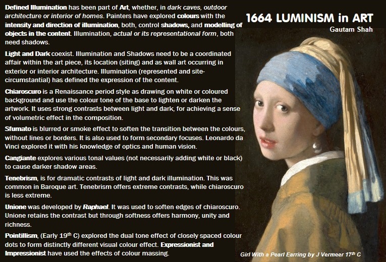
Defined Illumination has been part of Art, whether, in dark caves, outdoor architecture or interior of homes. Painters have explored colours with the intensity and direction of illumination, both, control shadows, and modelling of objects in the content. Illumination, actual or its representational form, both need shadows.

Light and Dark coexist. Illumination and Shadows need to be a coordinated affair within the art piece, its location (siting) and as wall art occurring in exterior or interior architecture. Illumination (represented and site- circumstantial) has defined the expression of the content.

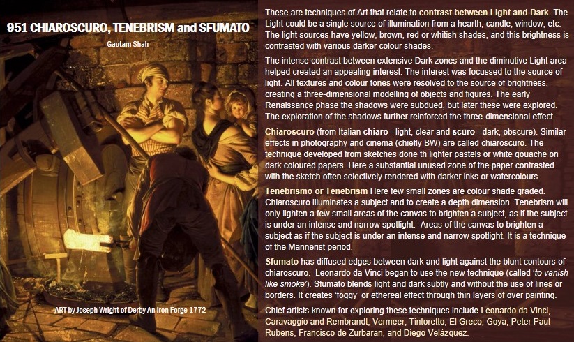
Chiaroscuro is a Renaissance period style as drawing on white or coloured background and use the colour tone of the base to lighten or darken the artwork. It uses strong contrasts between light and dark, for achieving a sense of volumetric effect in the composition.

Sfumato is blurred or smoke effect to soften the transition between the colours, without lines or borders. It is also used to form secondary focuses. Leonardo da Vinci explored it with his knowledge of optics and human vision.

Cangiante explores various tonal values (not necessarily adding white or black) to cause darker shadow areas.

Tenebrism, is for dramatic contrasts of light and dark illumination. This was common in Baroque art. Tenebrism offers extreme contrasts, while chiaroscuro is less extreme.

Unione was developed by Raphael. It was used to soften edges of chiaroscuro. Unione retains the contrast but through softness offers harmony, unity and richness.

Pointillism, (Early 19th C) explored the dual tone effect of closely spaced colour dots to form distinctly different visual colour effect. Expressionist and Impressionist have used the effects of colour massing.

1664 LUMINISM in ART

1565 LUMINESCENCE, FLUORESCENCE, PHOSPHORESCENCE and IRIDESCENCE

1565 LUMINESCENCE, FLUORESCENCE, PHOSPHORESCENCE and IRIDESCENCEby Gautam Shah

All these words have a suffix or end escence =it expresses the beginning of an action or process, beginning to be, do, show, etc.

These words, here, also relate to heat, energy, warmth, glow and light.

Luminescence commonly mean a radiation emitted by an atom or a molecule following the absorption of energy and transition into an exited state. The word, luminous basically means giving off light. In case of the chemiluminescence, the light emission is due to a chemical reaction.

Fluorescence occurs when a material has ability to absorb light and then emit it at a longer wavelength or lower energy level. The emission takes place immediately, and is only visible as long as the light source has UV component. This is a radiative mechanism, where, electrons transit from low excited state to the normal (no excitement) state.

Phosphorescence the material can store the absorbed energy, and release it later, but also at a longer wavelength or lower energy level. The feeble glow remains, even after a light source is switched off.

Iridescence is an optical phenomenon of surfaces. It occurs when some surfaces change their perceived colour for two main reasons: Change in the angle of view or illumination. It is often caused by multiple reflections from two or more semi-transparent surfaces. Refer to Design Synopsis Blog > 522 IRIDESCENCE.

1565 LUMINESCENCE, FLUORESCENCE, PHOSPHORESCENCE and IRIDESCENCE

1505 CHEVREUL -the Colour master of the age

1505 CHEVREUL –the Colour master of the age -by Gautam Shah

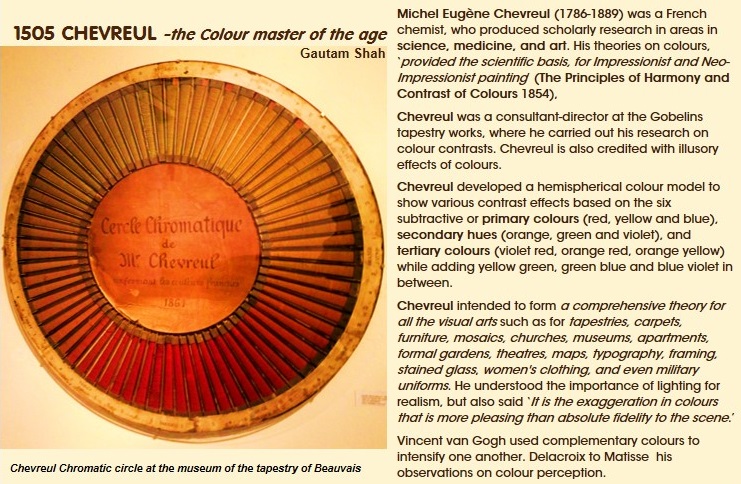
Michel Eugène Chevreul (1786-1889) was a French chemist, who produced scholarly research in areas in science, medicine, and art. His theories on colours, ‘provided the scientific basis, for Impressionist and Neo-Impressionist painting’ (The Principles of Harmony and Contrast of Colours 1854).

Chevreul was a consultant-director at the Gobelins tapestry works, where he carried out his research on colour contrasts. Chevreul is also credited with illusory effects of colours.

Chevreul developed a hemispherical colour model to show various contrast effects based on the six subtractive or primary colours (red, yellow and blue), secondary hues (orange, green and violet), and tertiary colours (violet red, orange red, orange yellow) while adding yellow green, green blue and blue violet in between.

Chevreul intended to form a comprehensive theory for all the visual arts such as for tapestries, carpets, furniture, mosaics, churches, museums, apartments, formal gardens, theatres, maps, typography, framing, stained glass, women’s clothing, and even military uniforms. He understood the importance of lighting for realism, but also said ‘It is the exaggeration in colours that is more pleasing than absolute fidelity to the scene.’

Vincent van Gogh used complementary colours to intensify one another. Delacroix to Matisse his observations on colour perception.

1505 CHEVREUL -the Colour master of the age

1304 DESIGNING with ILLUMINATION

1304 DESIGNING with ILLUMINATION -by Gautam Shah

For design, visibility of objects depends on illumination from, sun and burning or heating. Both, the natural and artificial sources of light get redistributed through refraction, reflections and diffractions. This could be due to the micro particulate matters and various interventions of atmospheric elements, changes in the mediums that light transits, and various surfaces.

Solar light is a strong and distanced source. It arrives as a cascade of parallel rays. Natural illumination can be barricaded, filtered and the orientation redirected but source position cannot be changed.

Illumination from burning or heating is called artificial (man-made). It can be very intense and concentrated to diffuse, but with an identifiable source of origin and measurable distance. Artificial sources are switchable and manipulable.

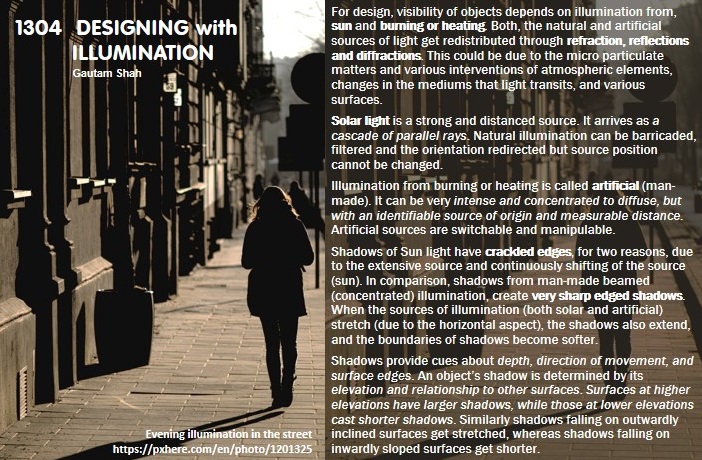
Shadows of Sun light have crackled edges, for two reasons, due to the extensive source and continuously shifting of the source (sun). In comparison, shadows from man-made beamed (concentrated) illumination, create very sharp edged shadows. When the sources of illumination (both solar and artificial) stretch (due to the horizontal aspect), the shadows also extend, and the boundaries of shadows become softer.

Shadows provide cues about depth, direction of movement, and surface edges. An object’s shadow is determined by its elevation and relationship to other surfaces. Surfaces at higher elevations have larger shadows, while those at lower elevations cast shorter shadows. Similarly shadows falling on outwardly inclined surfaces get stretched, whereas shadows falling on inwardly sloped surfaces get shorter.

1304 DESIGNING with ILLUMINATION

1212 ART MOVEMENTS with COLOUR AND LIGHT

1212 ART MOVEMENTS with COLOUR AND LIGHT -by Gautam Shah

Some of the Art movements based on Colour and Light techniques during late 19th to early 20th C are very briefly discussed here.

Impressionism: The painters recorded nature in terms of the fleeting effects of the colour and light. The light was interpreted through various colours and the emotions one wanted to express.

Neo-Impressionism (1980-90): The French painters of late 19th C the theoretical (sensorial) and realist interpretations of the impressionists. The Neo-Impressionists (like Georges Seurat, Paul Signac), rather relied on ‘scientific optical principles of light and colour that became fashionable’ in the period.

Divisionism and Pointillism (1880-90s): These derived fro Seurat’s painting created by placement of dots of contrasting colours, to be perceived as a single tone. No lines were employed.

Orphism (1910-13) Orphism (also called Simultaneism, orphic cubism) gave priority to the light and brilliant colours. Orphism introduced non-objective painting with dynamic expanses of rhythmic form and chromatic scales.

Rayonism (1912-14) was a style of Russian abstract art of 1910–1914. It was based on the effect of dark colours on the semi-light tones for landscape or cityscapes.

Cloisonnism (1888-94) A style name coined from metalwork technique of ‘cloisonné’. It was a post-Impressionist painting manner, where areas of colour are separated by dark lines’.

1212 ART MOVEMENTS with COLOUR AND LIGHT

1128 MODELLING SHADOWS in DRAWINGS and PRESENTATIONS

1128 MODELLING SHADOWS in DRAWINGS and PRESENTATIONS -Gautam Shah

Shadows in drawings and other presentations are used for modelling of solid (3D) objects. Shadows provide cues about depth, direction of movement, and surface edges.

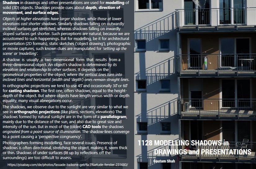
Objects at higher elevations have larger shadows, while those at lower elevations cast shorter shadows. Similarly shadows falling on outwardly inclined surfaces get stretched, whereas shadows falling on inwardly sloped surfaces get shorter. Such perceptions are natural, because we are accustomed to such happenings. But for modelling, be it for architectural presentation (2D formats), static sketches (‘object drawing’), photographic or movie captures, such known clues are manipulated for ‘setting up the scene’ or ‘modelling’.

A shadow is usually a two-dimensional form that results from a three-dimensional object. An object’s shadow is determined by its elevation and relationship to other surfaces. It depends on the geometrical properties of the object, where the vertical lines turn into inclined lines and horizontal (width and ‘depth’) ones remain straight lines.

In orthographic projections we tend to use 45̊ and occasionally 30̊ or 60̊ for casting shadows. The first one, offers shadows, equal to the height-depth of the object. But where objects have length versus width or depth equality, many visual aberrations occur.

The shadows, we observe due to the sunlight are very similar to what we see in orthographic projections (like plans, sections, elevations) The shadows formed by natural sunlight are in the form of a parallelogram, mainly due to the distance of the sun, and also due to great size and intensity of the sun. But in most of the (older) CAD tools the shadows originated from a point source of illumination. The shadow-lines converge to a point causing a ‘perspective congruency’.

Photographers forming modelling, face several issues. Presence of shadows is often directional, stretching the object, making it, seem thick or thin. Shadows of under surfaces (lit up by reflections off the surroundings) are too difficult to assess.

1128 MODELLING SHADOWS in DRAWINGS and PRESENTATIONS